Trouble Puppet Theater Company
Non-Profit Website Redesign

Overview:
Role: UX Designer
Team: 3 UX Designers
Methods: User Interviews, Surveys, Competitor Analysis, Wireframing, Visual Design, Prototyping & Testing
Tools Used: Figma, Miro, Adobe Color, Mural, Canva, Zoom
Duration: 2 weeks
Trouble Puppet is a small non-profit theater group in Austin, Texas. Their mission as an organization is to inspire social change through the art of puppetry. Trouble Puppet hosts puppet shows based on many different literary works that ultimately focus on social justice and organized labor movements. Our team’s challenge was to redesign their original website, in order to improve the overall user’s experience.
User Research
User Observations of Original Website
We tested the Trouble Puppet original website on potential users. We asked questions regarding first impressions, their opinion on what they thought the organization does, and simple tasks - like how to purchase show tickets.

Quotes from user testing:
“The pictures at the front didn’t tell me what this was for".”
“Are the shows kid friendly?”
“I have not seen anything like this, this is something I’d like to experience.”
“I wish the mission statement would be more up front.”
Stakeholder Insight
Our team spoke with Connor Hopkins, the Artistic Director of Trouble Puppet Theater Company. Connor is unhappy with the current website, and said that it doesn’t accurately represent the organization. Their main purpose is social/political activism, which is very important to Connor and his theater company. Trouble Puppet began when they realized that they couldn’t change people’s minds with just protests. Connor pointed out that, “Art changes hearts and minds,” which is what Trouble Puppet is set out to accomplish.
We also discussed the purpose of the website in order to align our user goals, design a website to meet Connor’s needs, and creating a pleasing user experience.

Survey Data
After receiving permission to post on the Trouble Puppet official Facebook page, we gathered survey data from the Trouble Puppet Theater fans and members of the Facebook group.
Survey results:
What was most desirable about Trouble Puppet by surveyors:
The pure puppetry
The subject matter of the shows
The community
User Persona: Ophelia
Ophelia is a social, local artist supporter who is well-read, and wants to support social causes. Ophelia wants to buy Trouble Puppet tickets and dig deeper into their mission.

2. Ideation
Ophelia’s User Journey
After creating an empathy map, our user journey was created, with our user testing in mind, as if Ophelia was navigating through tasks on the website. She would want to find out more about trouble puppet, found the text to be quite wordy, as well as want to know the intentions of Trouble Puppet- is it art, entertainment, or activism?


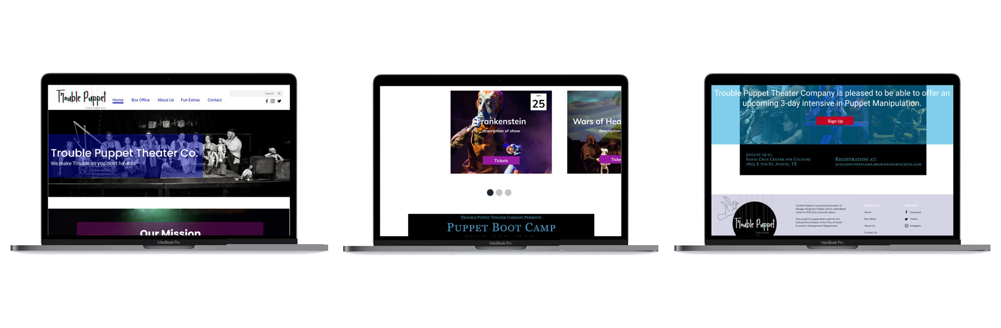
Site Map: Improving the Homepage
Our team decided to keep the navigation simple and usable, similar to the original website’s global navigation. We wanted to focus on as many actions as possible on the homepage for the user, rather than the original site which only consisted on a carousel of images.
Style Guide

The style guide was inspired by the website’s production photos which portrayed the colors of the puppets and the theatrical scenery. We also included overlays in the final prototype in order to convey a theatrical feel.
3. Prototyping and User Testing
Creating the Prototypes
After each team member sketched a paper wireframes, we put our ideas together and iterated on our high fidelity prototypes. Some of the important features we wanted to include on the homepage based off of our research and ideation include:
A mission statement in the hero image in order to explain Trouble Puppet’s purpose
Quickly view and purchase tickets
Link to desktop clickable prototype

Link to mobile clickable prototype
User Test Results
Changed mobile banners to darker color
Changed display images in photo gallery in order for the text to be visible
Added an “X” on the mobile search screen in order to easily exit the page
Changed the white copy on colored background so the copy doesn’t get lost & removed white borders on images


4. Retrospection
Final Thoughts
We learned that it is important to get a stakeholder’s valuable insight into what their goals are out of the website. In this case, it was difficult to know exactly Trouble Puppet Theater Company’s goal until we received feedback from Connor, the Artistic Director of the company.
White text on a colored background is not helpful for a great user experience. The text gets very lost and is difficult for the user to skim or read.
It’s OK to keep the same type of navigation when redesigning, if the original navigation is the best fit for the site.