National Science Foundation
Government Website UI Redesign

Overview
The National Science Foundation is a United States Government website that offers Research, Information, and Funding Resources to the public. The goal of this project is to redesign the original website in order to create new, responsive desktop and mobile versions.
Role: UX Designer
Team: 4 UX Designers
Methods: User Interviews, Heuristic Evaluation, Wire Framing, Visual Design, Prototyping & Testing
Tools Used: Figma, Miro, Google Drive, Adobe Color, Zoom
Duration: 3 weeks
The Problem
Scientific research requires funding and can be a daunting piece of the research puzzle. Organizations and universities often rely on the NSF as a large resource for funding; therefore, while conducting user testing on the NSF website, we discovered insights which reveal a redesign would be beneficial to create a funding system that is usable, useful, desirable and as a result, valuable.
The Solution
The goal is to redesign the NSF website by using accessible, universal, and modern User Interface conventions, therefore, creating a more seamless experience for researchers seeking funding through the NSF.
User Interface Analysis

Original National Science Foundation Homepage

Proto-Persona
After studying the National Science Foundation homepage, each of our team members created their own unique Proto-Personas.
After combining our ideas, we landed on Bill Neal as our user for the NSF.gov website.
Bill Neal is a published researcher who has dedicated his life to science. He often applies for grants and is always looking for more funding.
Interviewing Scientists
Our persona, Bill Neal, gave my team an idea on who is the target demographic for this website, so we interviewed 5 people who were in the scientific field that would potentially visit the National Science Foundation for funding opportunities or information. Our collective interview results were synthesized into an affinity diagram.
We found that most users’ pain points are focused on the overwhelming amount of tabs and information that made it difficult to achieve specific task goals.

-
User Flow
Our user follows our persona, Bill Neal, as if he is preparing for an Antarctic research project. He wants to apply for a grant and needs to understand the requirements and identify which opportunities he is eligible for. We conducted user tests based off of this user flow.

-
User Testing and Task Evaluation
We conducted the user tests by having four users go through a set of five tasks. The task flow was created as if the user is searching for funding opportunities in the Antarctic. We wanted to test out each important tab in this flow in order to get a full scope of what works and what needs improvement.
We found that our participants relied heavily on the search bar, and some could not fully complete tasks, due to the cluttered and confusing navigation.

2. Usability Testing
Heuristic Evaluation and Notations

By annotating the user navigation from the user flow and testing scenarios, we were able to focus our attention to the website’s navigation issues. For example, as seen on number 6, funding opportunities should be much higher on the page, because this information is what users typically want to see and use most of the time, based on our user tests and interviews.
Usability Testing: Navigation
Four navigation usability tests were conducted, two using the desktop format and two using the mobile format. Our users found both versions confusing with a number of issues needing attention.
On the desktop format, redundancy was a major issue, and on the mobile version, spacing and a lack of content chunking were the notable pain points.

Navigation User Task Evaluation
3. Ideation
Card Sorting
Each team member independently conducted a card sorting exercise. When our findings were collectively evaluated, we discovered that collaboration was necessary for unifying our ideas. The process not only clarified our individual visions, but also helped to create a clear, group conscious effort.
After analyzing the team members’ individual card sorting exercises, we combined our discoveries to develop the most important ideas. We decided on organizing the cards by creating fewer global navigation subjects, and only including content that is relevant and necessary to those individual tabs.

Site Map
The card sorting process helped to further develop our product, while our site map was essential in defining its navigation. We developed a site map we felt was simple to use and encompassed the NSF website. After learning that a footer is not included in a site map, we deleted the addition, as well as added necessary pages.
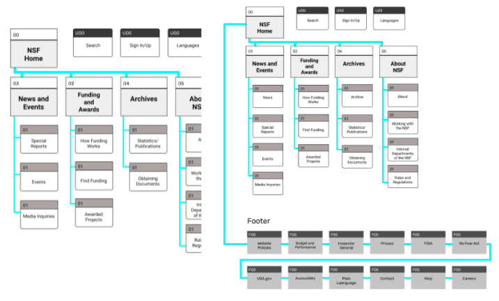

Final Iteration
The final iterated site map includes the four global navigation categories - News and Events, Funding and Awards, Archives, and lastly, About NSF. This arrangement is a simplified version of the original website global navigation.
4. Prototyping & Testing
Creating the Desktop and Mobile Navigation Wireframes
Desktop:

Mobile:

Conducting 5 Second User Tests
We tested six people using the five second user test method and found that we needed to clarify the National Science Foundation as the owner of the website. To do so, we incorporated the logo and added the name of the National Science Foundation to the top of the page, which greatly effected our testing purposes. It is an error that could have easily be avoided.

Creating Low-Fidelity Wireframes
After creating the navigation wireframes, we began to create the low-fidelity wireframes for the homepage. We made many iterations to this page, with a majority of the discussion focusing on the hero image. Eventually, we settled on the final iteration of the hero to only include a video and a description of the National Science Foundation purpose, by consulting the analysis, user interviews, and testing results that found most users are uncertain of who the National Science Foundation is and what their goal is to accomplish.

5. Adding UI Elements to Final, High-Fidelity Wireframes
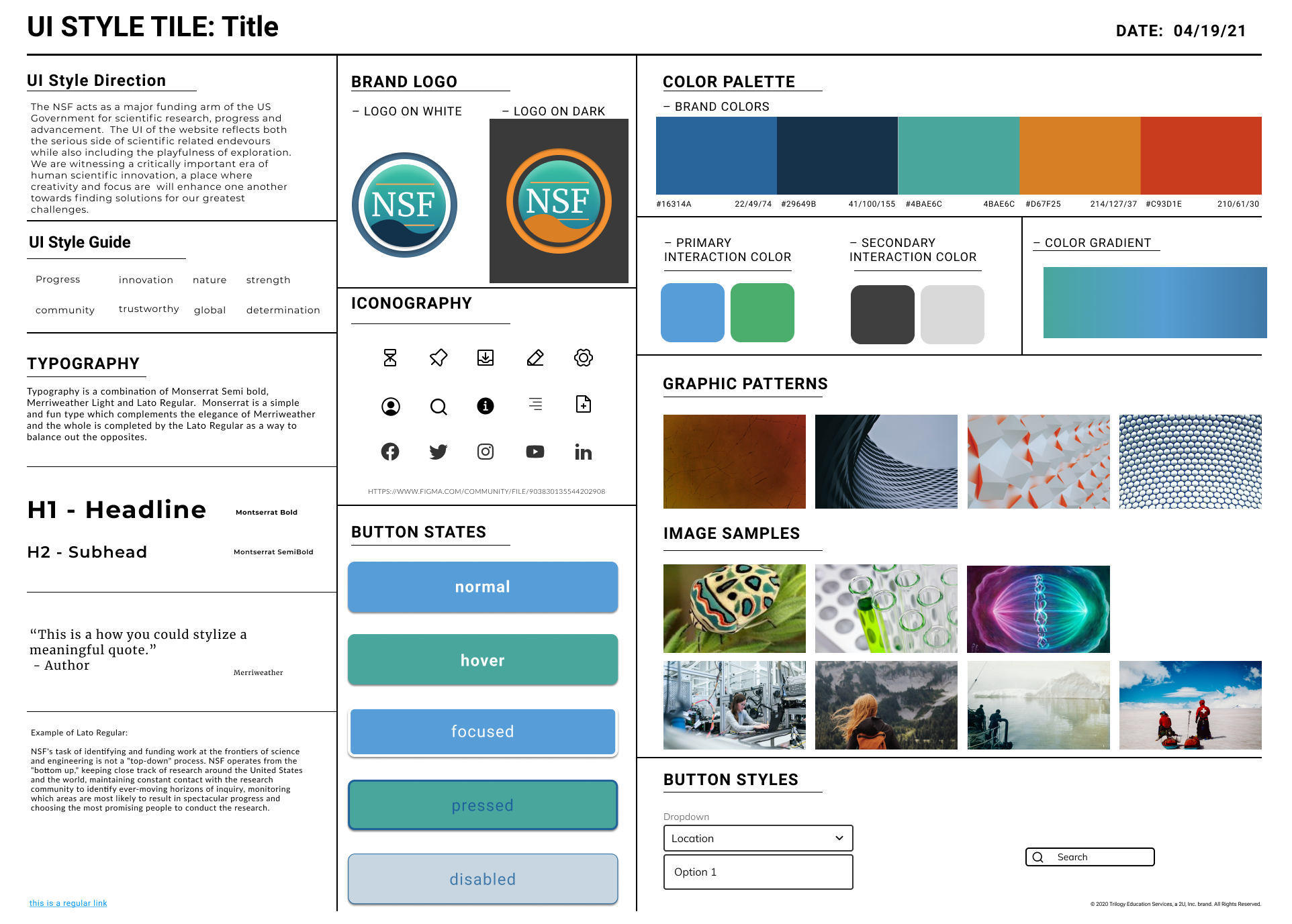
Style Guide Creation
We recreated the original NSF logo for a more sleek and nature-influenced design vision. Also, we updated the original colors in order to have color accessibility, which the original website lacked. Our goal was to choose colors, buttons, and typography that convey trust, innovation, and progress.
6. Testing High-Fidelity Prototypes
Final Prototypes
We conducted eight usability tests. four were focused on our mobile prototype, and four were focused on our desktop prototype. Our testers struggled to use the dropdown menu. Also, we concluded that using a scroll bar would be easier for our users. We also added the map showing the NSF’s global influence to the mobile version, which we had previously removed due to an attempt to less complicate the page’s appearance and functionality.

Link to desktop clickable prototype

Link to mobile clickable prototype
6. Retrospection
Final Thoughts
We learned the importance of user testing when redesigning a website, and how it is important to test the original site and the final prototype in order to have the best user experience.
We learned how to test color accessibility in Adobe Color, and the steps that need to be taken in order for a website to be fully accessible for all users.
Sitemaps are a crucial aspect of a major UI redesign, because they have the ability to create a clear and simplified layout of what, in this case, could turn a cluttered navigation system into a simple and easy one.