Alley-oop
Non-Profit Website for Underserved Community Basketball Program
Overview
Our team wanted to create a site for a youth sports league in an underserved community around Austin, TX, where families may have little or no access to sports outside of school. According to our research, playing sports can have a lasting and positive impact on kids, as well as the benefits of keeping them active and healthy. It can help them develop coordination, motor skills, boost self-confidence, and teach social skills as well. Often times financial barriers prevent kids and families from being able to participate in sports leagues, so we wanted to create an organization that potentially could remove that barrier. Therefore, we created a website to reach parents, volunteers, and donors.
Role: UX Designer
Team: 5 UX Designers
Methods: User Interviews, Surveys, Competitor Analysis, Wireframing, Visual Design, Prototyping & Testing
Tools Used: Figma, Miro, Adobe Color, Google Sheets, Zoom
Duration: 2 weeks
1. User Research
Interviews and Surveys
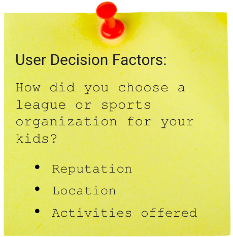
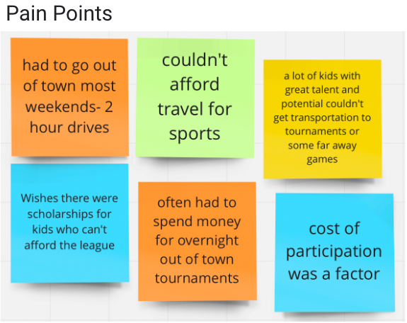
We interviewed 5 parents that have kids who play sports in low income areas, and could potentially be Alley-oop families. Based on our survey and interview data, most families choose sports based on location, reputation, and activities offered by the organization. The pain points these same users referenced overwhelmingly mention location/travel, and affordability.
Competitor Analysis
After research comparing direct and indirect competitors to our potential website, we found the YMCA in Austin to be our main competitor. We decided to use the YMCA website as a reference when choosing the best features to use from their website, as well as the services they provide in relation to children’s sports leagues. After user testing the YMCA website on 5 users, we concluded that our site needs to offer sign up and scheduling information on the homepage for easy access. Throughout our research, we also found that the YMCA offers affordability for a wide age range of kids, financial aid, and that the location of the facility may not be close enough to families.
2. Empathize, Empathize, Empathize
Empathy Map
While searching for those to interview, we wanted to make sure to interview parents who have or had children participate in sports. Another priority was to find parents who are single parents, work full-time, and/or are located in underserved communities in order to get the most accurate data as possible. From our affinity diagram and empathy map, we found that the three pain points for the users were cost of participation, excessive traveling for sporting practice or games, and difficulty to balance the amount of practices throughout the week.
Creating a User Persona
This led us to our persona Jess, a single mother who works a 9 to 5 job. Even though providing for her kids keeps her busy, she recognizes the importance of stimulating and socializing her kids in a healthy and safe way, but in order for her to get her kids involved, she would need a little help. Transportation, flexibility, and low cost participation are top priorities for Jess.
3. Ideation
Card Sorting
Objectives: make the site beautiful, simple, and help busy parents sign their kids up for sports.
Main information on home page
Help parents feel confident in their choice
Allow users to quickly complete goal (sign up)
4. Prototyping and Testing
Paper Wireframes
Some common features we wanted to include were a logo, a hero image, simple navigation, and donate/login buttons in the top right. We also wanted to have the available sessions right on the homepage for parents to browse as well as a ‘sign up now’ call-to-action.
High Fidelity Wireframing
Link to clickable desktop prototype
User Testing the Wireframes
Findings after five user tests:
Change the hero image: hero image was not suited to our targeted users, the original was more confusing due to the content and colors
Add more sign up points: the users were looking for more ways to sign-up rather than just one
Make homepage easily accessible: users could not easily access the homepage so we added a link to the top navigation bar
Removed the search bar and social icons: Our users didn’t have reasons to utilize the search bar, and it confused more users than it helped their search. The social links were removed, because most users said they would look in the footer for social links first
Removed the drop shadow from My Profile button: We realized by testing and feedback, a drop shadow should never be placed on text in a button
Created a homepage prototype: Our team realized the importance of creating a mobile version in today’s world, so we created the homepage mobile prototype
Link to mobile homepage prototype
5. Retrospection
Final Thoughts
Originally, our team only created a desktop version; however, after some reflection we realized that we need to create a mobile version due to the importance of a mobile presence, and considering our target demographic probably uses their mobile phones for research more so than a desktop computer.
We learned the importance of interviewing the correct demographic. Due to the fact that ours was so specific, the data would have been skewed if we ignored the characteristics of our users. They needed to have the experiences of having children in sports in an underserved area in order for us, the designers, to be able to empathize with them and apply that research to make the best website for them.
Lastly, we learned to take advantage of free, online UI Kits that are available and there to help UX designers begin creating a prototype. We began by creating the website’s layout from scratch, which takes longer and also doesn’t take advantage of better designs available.


